
Krown Fitness App Case Study
I completed a UX Bootcamp course at General Assembly. Below is a case study for a concept for a fitness app. Enjoy!

Intro
Krown is a project that came from my UX course at General Assembly in San Francisco. The objective of this work is an approachable app which helps gamers feel at ease when starting out on their fitness journey. The app features workouts and plans which will reward gamers with exclusive in-game content, acting as a trophy to their hard work away from the controller.
The problem: While video games are not proven to be a cause of obesity, it has been linked to a sedentary lifestyle. The more time spent on video games meant less time for cardiovascular activity.
Goal: Help gamers build sustainable and lifelong fitness habits.
My role: For this project, I wanted to explore ways of combining level-up systems from video games with video tutorial help from fitness apps. I achieved this through research, analysis, UX, and visual design work. I also wanted to create the brand and UI for the app as well.
Research
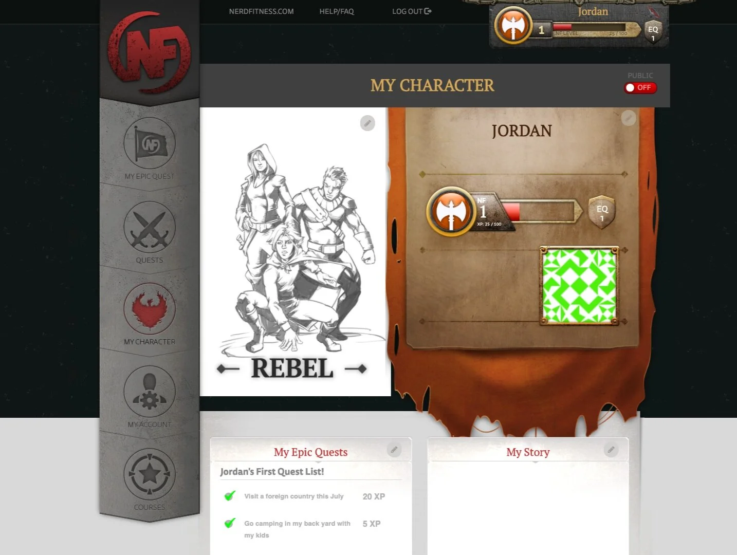
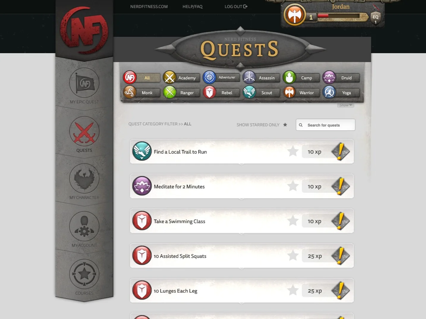
SWOT Analysis: Nerd Fitness Academy
Strengths: There has been proven results with this program. Quests and choosing your own character feels like a game. There is no other website or program geared to nerds.
Weaknesses: There is an abundance of information presented on almost every page of the website. User interface is confusing by switching back and forth between two main sites.
Opportunities: Creating a native mobile app could help users access their plans much easier.
Threats: Apps with better and more up-to-date UX would make the user and fitness journey more enjoyable.

Feature Analysis: I chose three competitors in the same landscape which catered towards automated fitness programs, including Nerd Fitness Academy. The goal was to observe which features each app showcased, as well as the expectations users might find from Krown. From my research, I found that most apps had systems to help users keep track of their exercise, but all lacked some sort of incentive to keep healthy fitness habits.

Feature analysis of competitors.

Survey and User Interviews: I found through research the “typical gamer” no longer exists. Gamers are now more social than ever and use social media and friends to influence them in their gaming experience. Studies have shown 57% of gamers seek opinions on social media before making a purchase (source).
Using that data, I conducted one-on-one user interviews and asked a series of questions regarding their fitness and gaming habits.
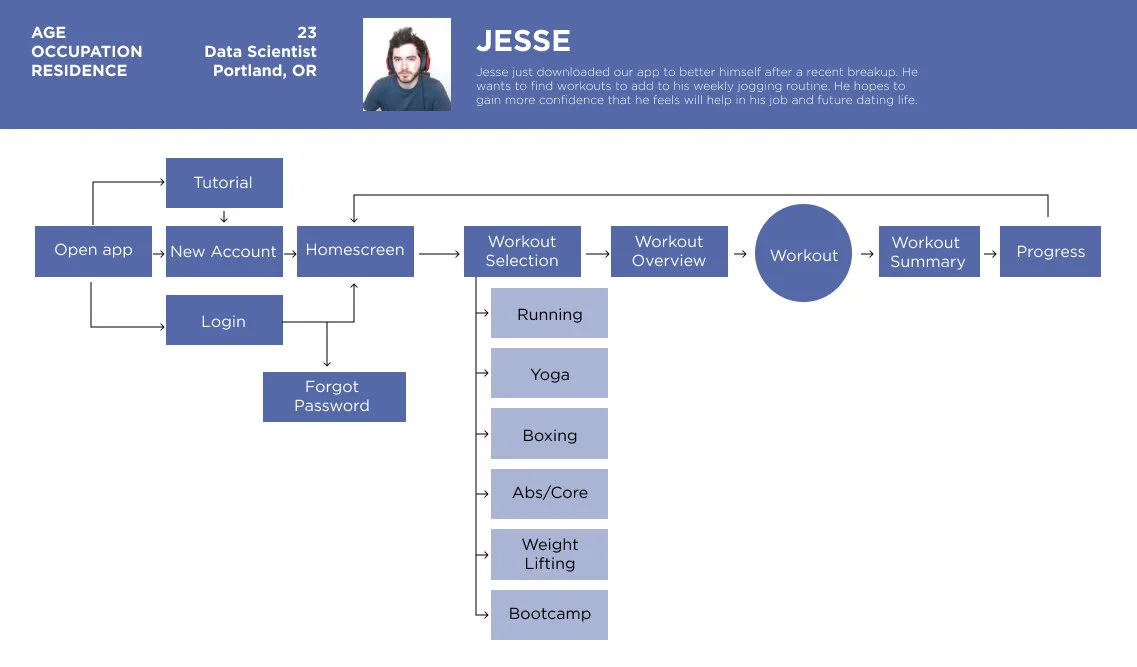
User Persona: Based on the user research conducted, I created a user persona who would become the target audience for Krown.

User flow: Creating a user flow for the on-boarding experience helped me understand which choices the user would take to sign up for their first course. I created a user flow for my persona.
Site Map: I based my site map around concept of progression. I started to think of the value prop of rewarded workouts and progression. I had a rough idea of the layout based on this theory.

Low Fidelity Sketches

Lo-fidelity Wireframe

Branding
Using my background in Visual and Brand Design, I created the color palette and UI elements for Krown.

Usability Testing
Task #1: I asked users to find their first workout program.
Observation: I observed some confusion among users on where to start. Some users expressed they didn’t know what kinds of workouts they wanted to do.
Solution: I decided to create an on boarding experience that guides users through a series of simple questions and recommends a workout program for them.

Task #2: I asked users to locate their fitness progress in the app.
Observation: Most users initially went to the Rewards tab and took a few additional tries before landing on the profile page (where fitness progress was shown). Based on this confusion, it became clear that users were looking for some other indicator for progress. One user expressed he reluctantly went under the Rewards tab initially.
Solution: I chose to restructure the navigation to combine fitness and gaming goals while separating profile and settings elements. Resulting in a tab for Progress and another for Settings.

Task #3: I asked users to explore the workouts asked if workouts were gamified enough to motivate them.
Observation: One user expressed “I feel this is text heavy.” The workout overview didn’t feel enough like a game, users wanted more visual cues for the upcoming workout.
Solution: I decided to add animated .gifs to visually breakdown the workouts into intervals for the user to advance through.

FINAL SCREENS


Thank you for reading!