User Experience Case Study

Client: Barry’s
UX Design: Jordan Black
Overview: Barry’s is a High Intensity Fitness Gym with an app where you can book classes, buy apparel, and pre-order shakes before your class.
Problem Statement: Each day hundreds of clients attend the gym, but I noticed there was virtually no pre-ordered shakes for the whole day. I saw opportunities for a better user experience to cause delight and be effective at the same time.
Users & Audience

User persona for a Barry’s client.
Emotional Journey Mapping
To evaluate the journey of the user, I conducted a user emotional journey mapping. I approached users who have a history of ordering a shake every class. Results showed users were bored of the same choices and longed for something new.
User’s Emotional Journey
Story Board

User Flow

Sketches

Lo-Fidelity Mocks

Hi-Fidelity Mocks

Outcomes & Results
Iconography
When a client has successfully booked a class they are presented with the confirmation screen. I felt the “Book a Guest” and “Buy an Add-On” sections were getting lost on the page, resulting on clients overlooking these areas in favor of the red CTA at the bottom.
My Design Decision:
Analytics showed a significant fallout of buying add-on options from this screen. I found there wasn’t enough emphasis placed on buying and add on or booking a guest. To understand why, I conducted an A/B usability test.
Results showed that 90% of users preferred the design with icons. Ease of use, more pleasing to the eye, and simplicity were the main reasons why users preferred iconography.

User feedback: “I like the pictures added to the options at the bottom. Easier to see what it is. Rather than just words.”

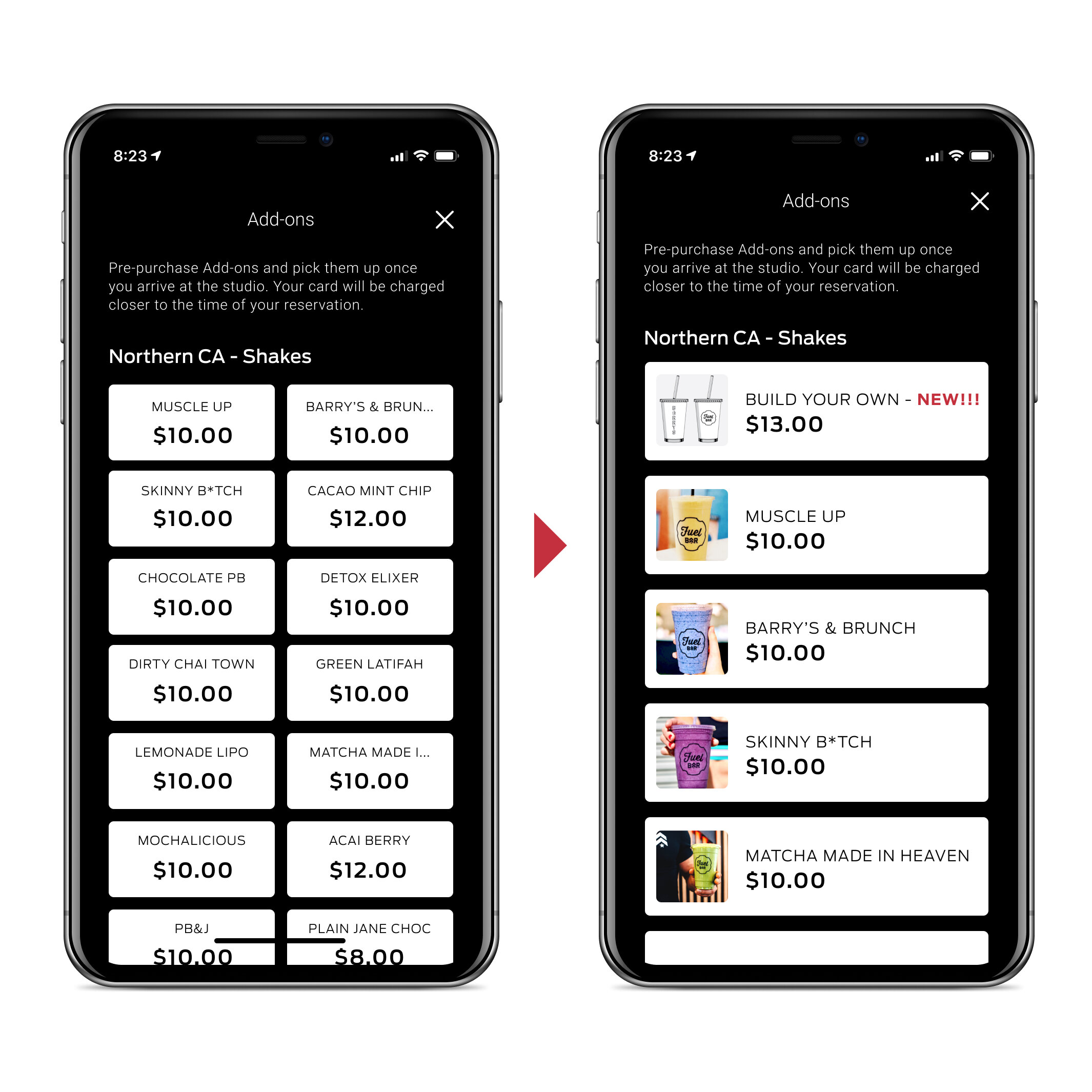
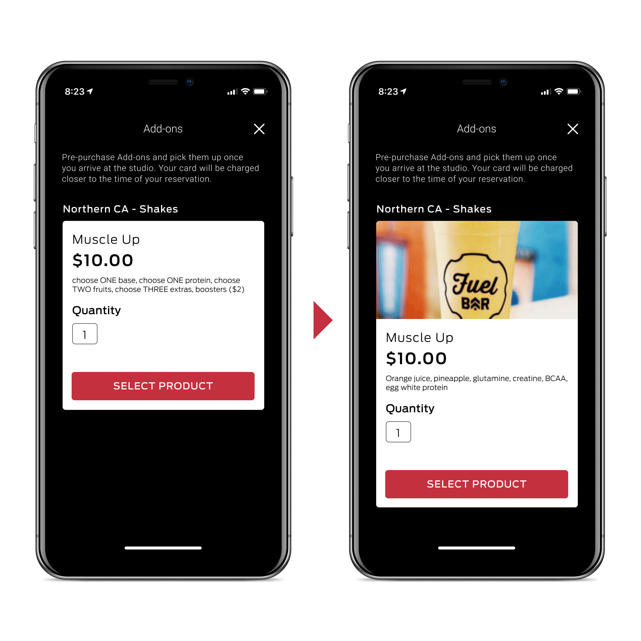
More Real Estate
After a client has booked a class, they may place an add-on order as well. The older screen had the minimum of the shake name and price. I saw an opportunity to add product shots for a more polished and mouth-watering experience.
My Design Decision:
Users expressed frustration not knowing what their particular shake looked like. To understand why, I asked users what improvements would be better. Most users said a better visual element would help.
Tests showed that 100% of users preferred having a picture of their shake. I also saw this as a chance for Barry’s to produce photography that will further enhance their brand.
User feedback: “I like being able to see what I’m ordering before.”

Add Item Button
Once a client has selected their selection, a final confirmation is presented before them. User feedback from the original screen was “I wish there could be an option to add more if needed.” I created another CTA to be in line with the other elements on the screen.
My Design Decision:
I chose to use an outlined CTA as to not compete with the Confirm Purchase button. But I felt the color red was still good to call more attention to adding an item.

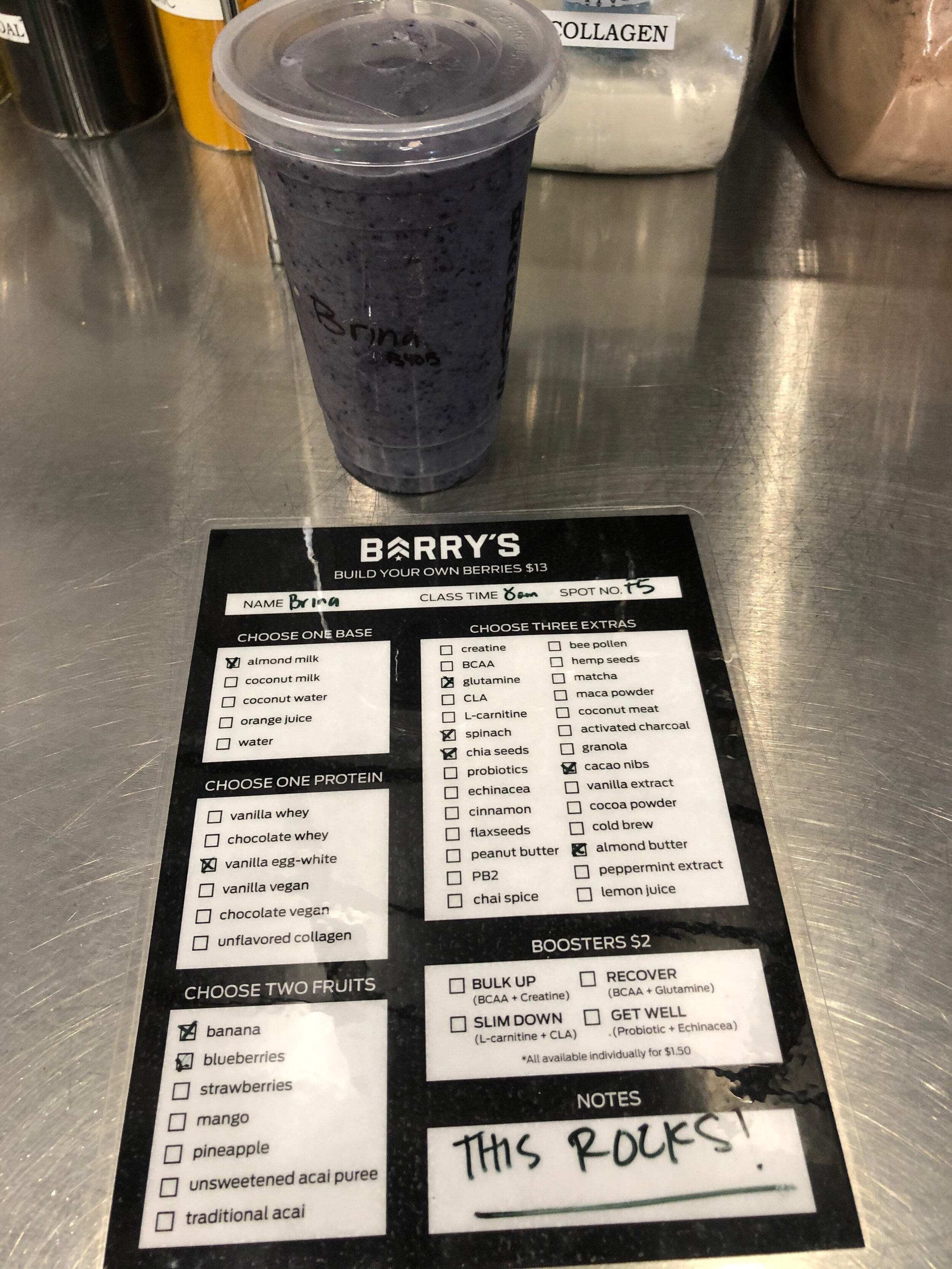
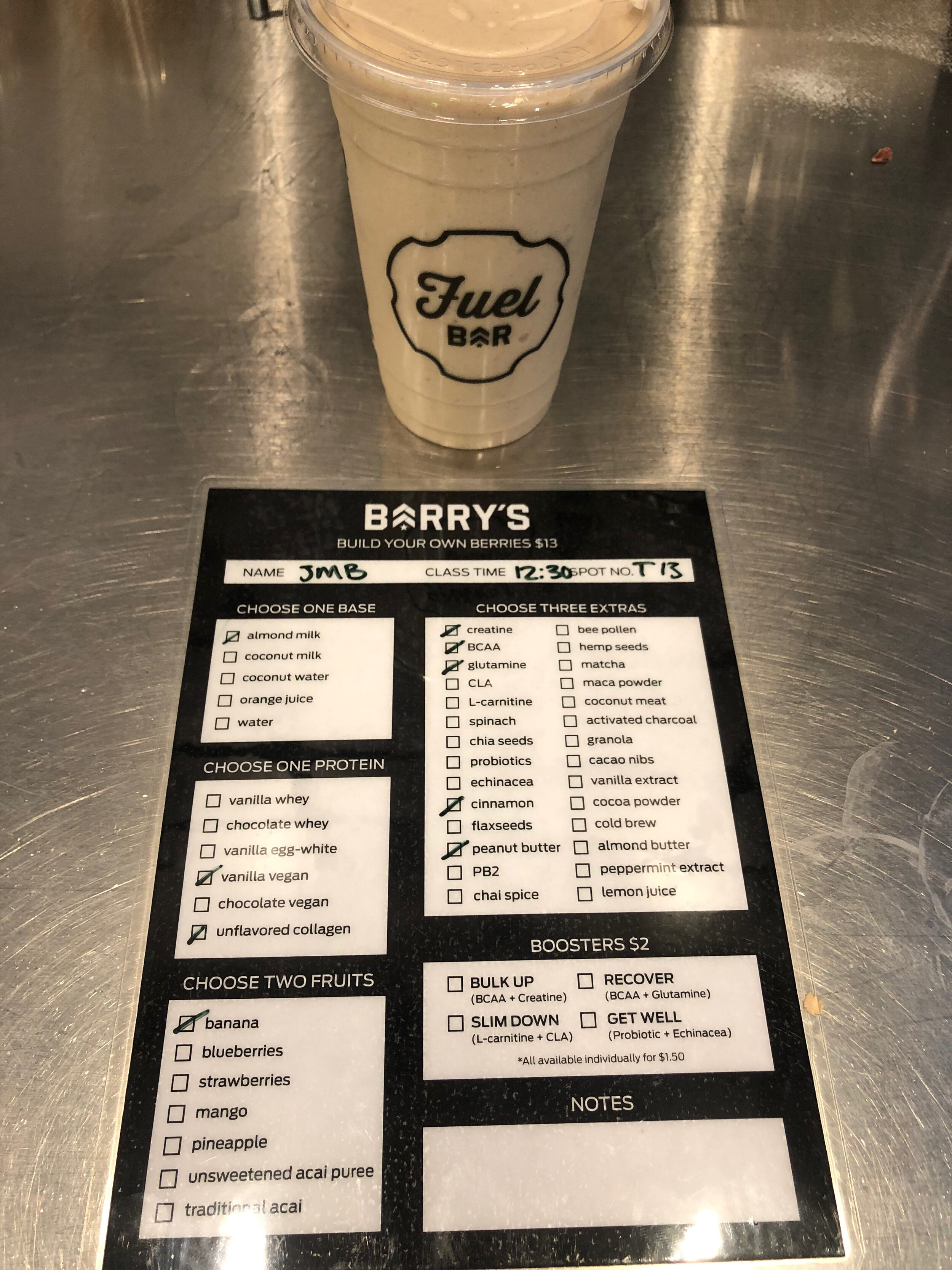
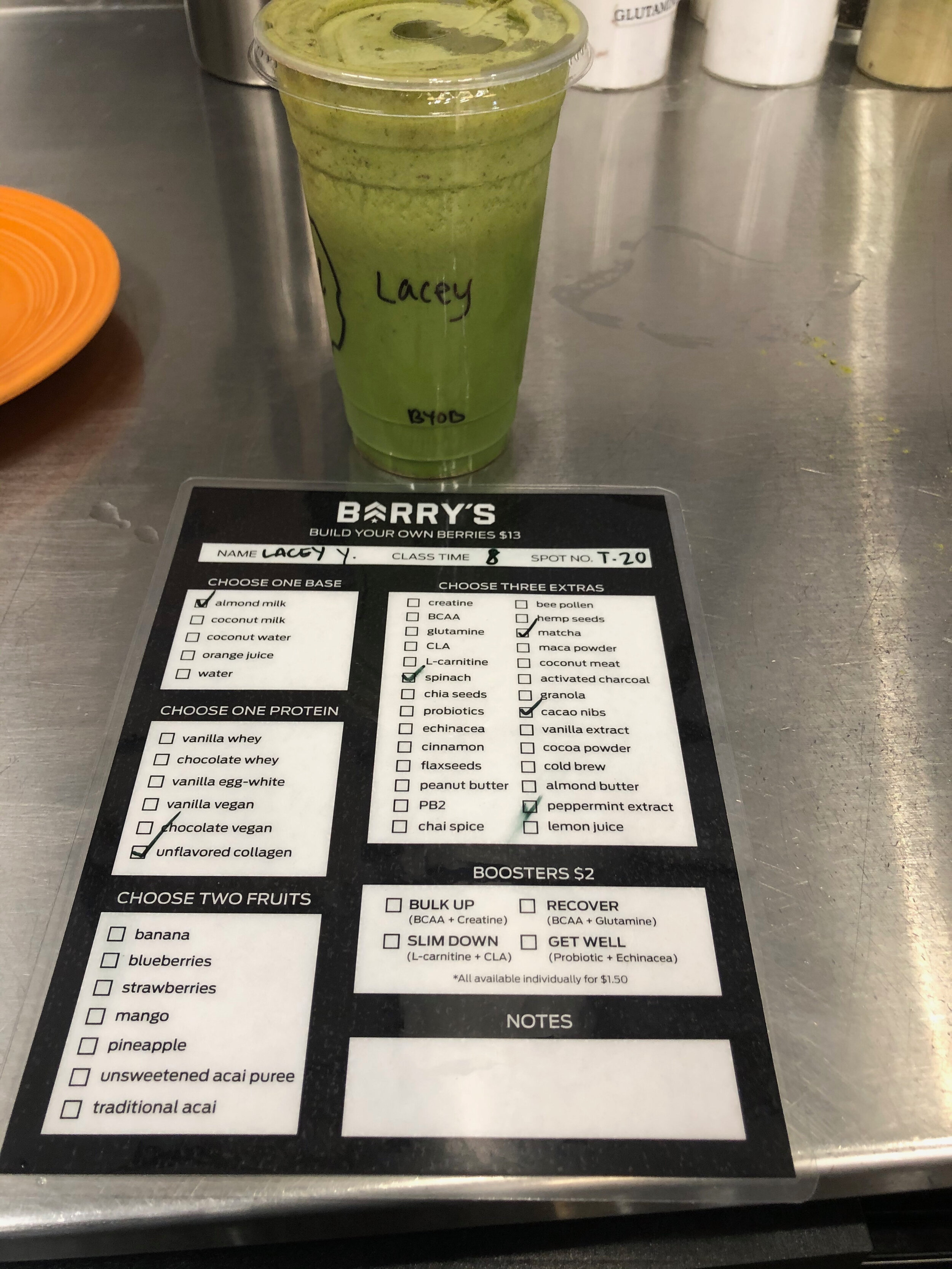
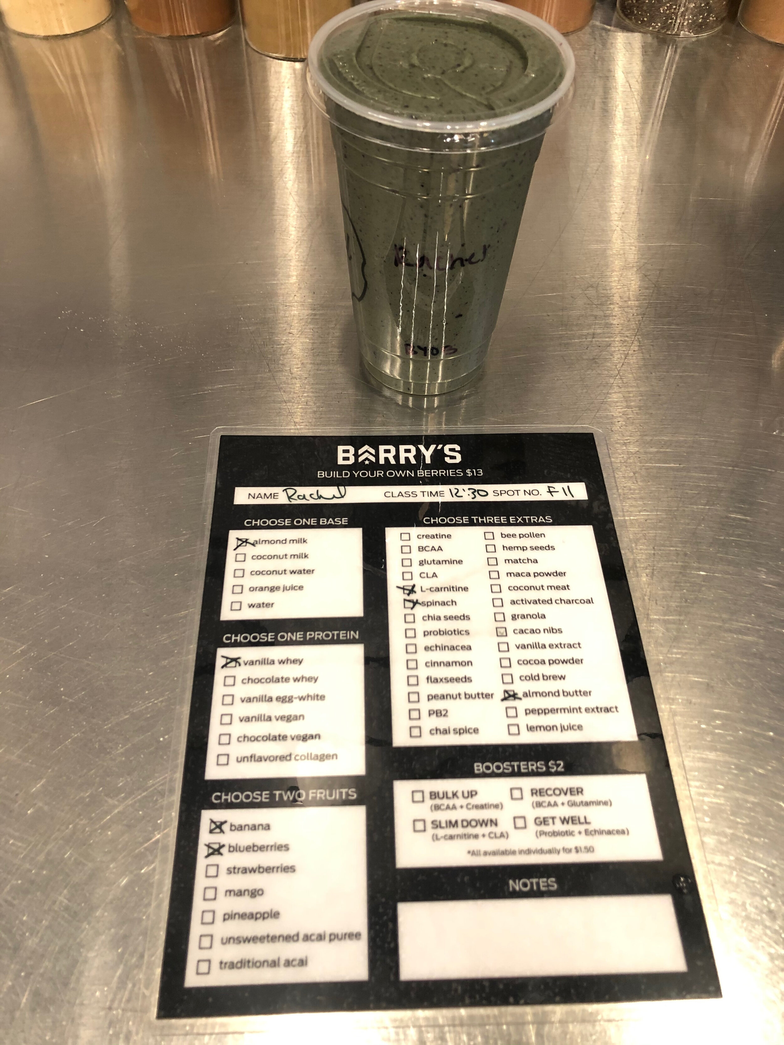
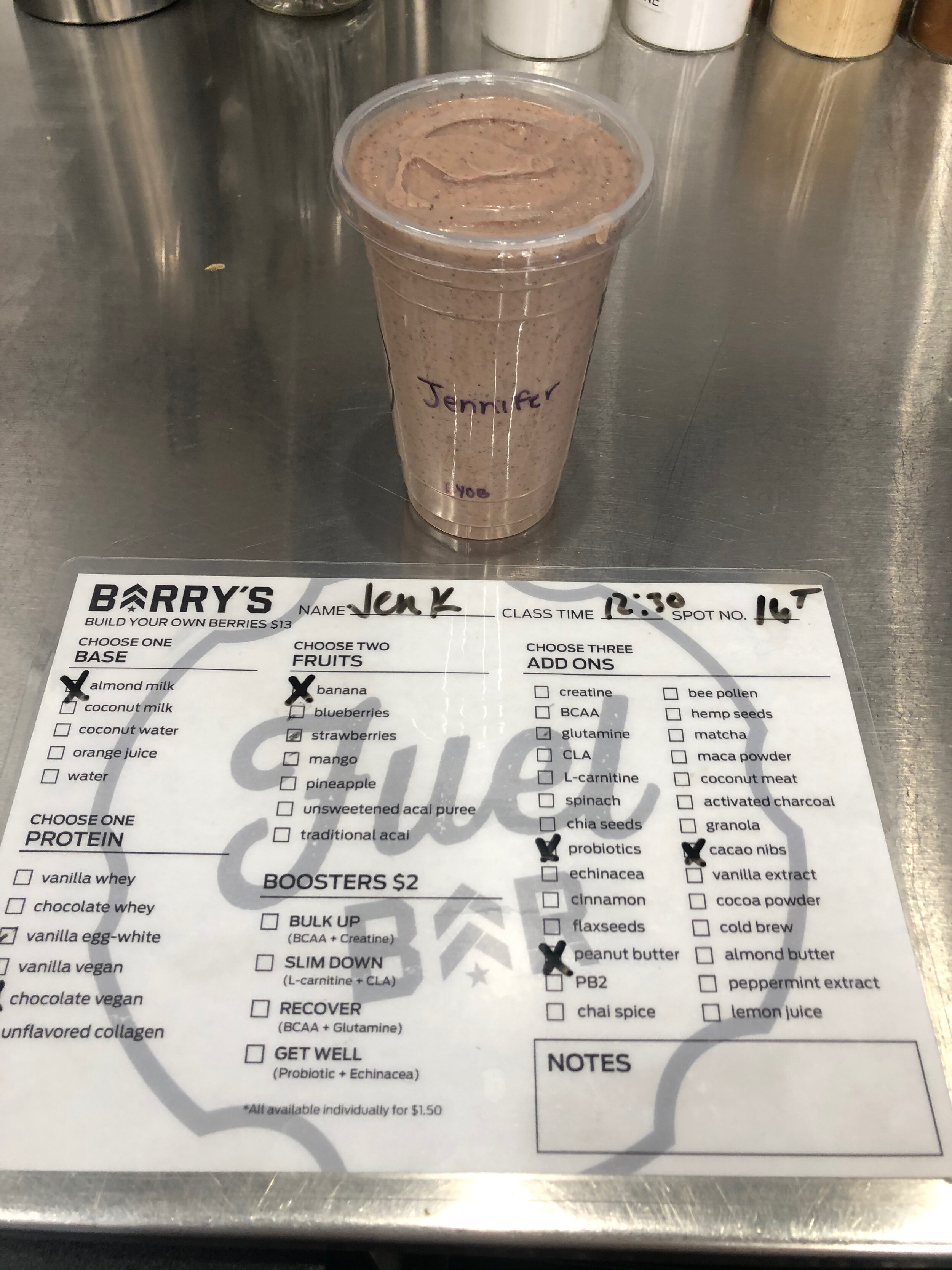
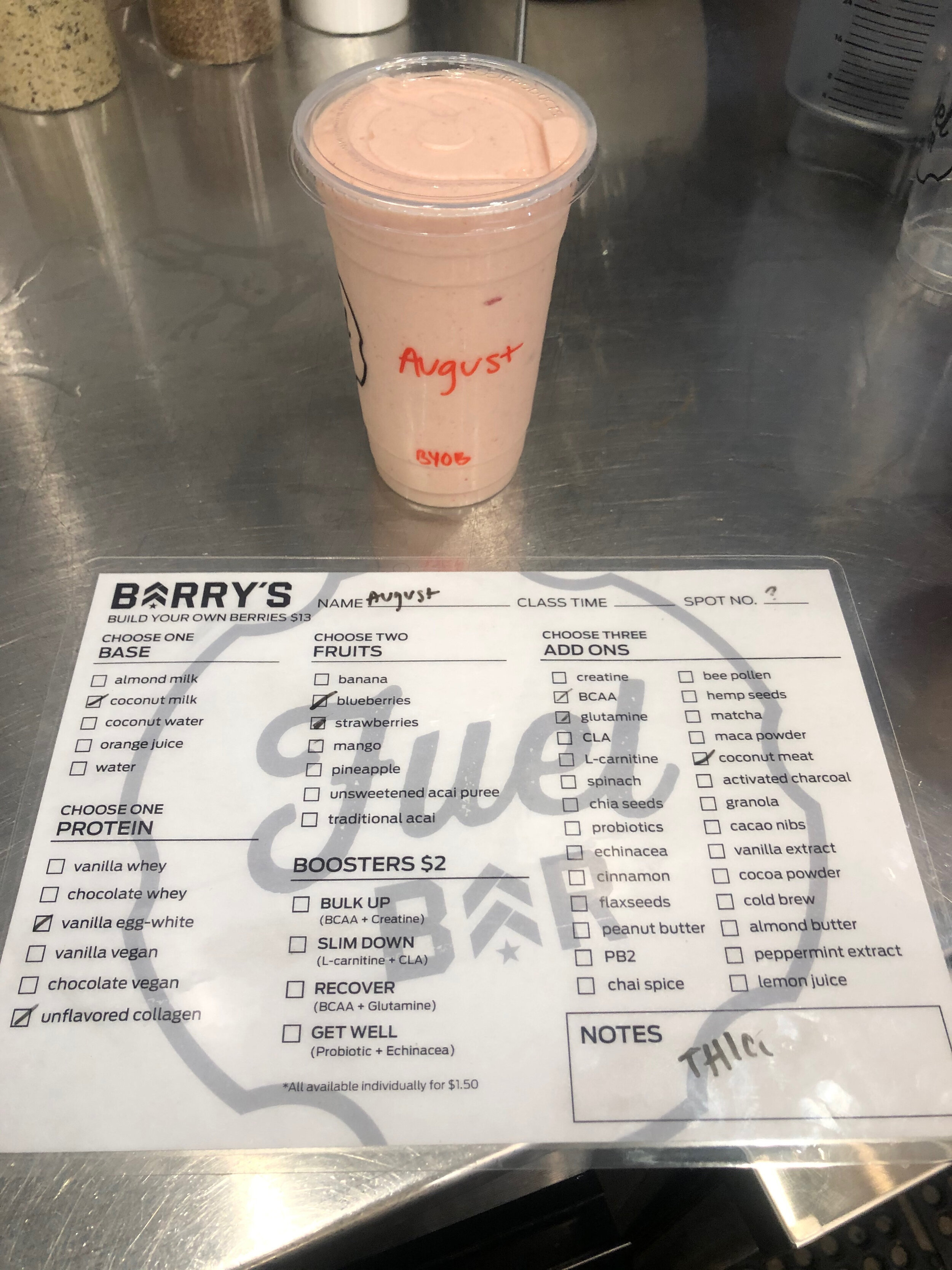
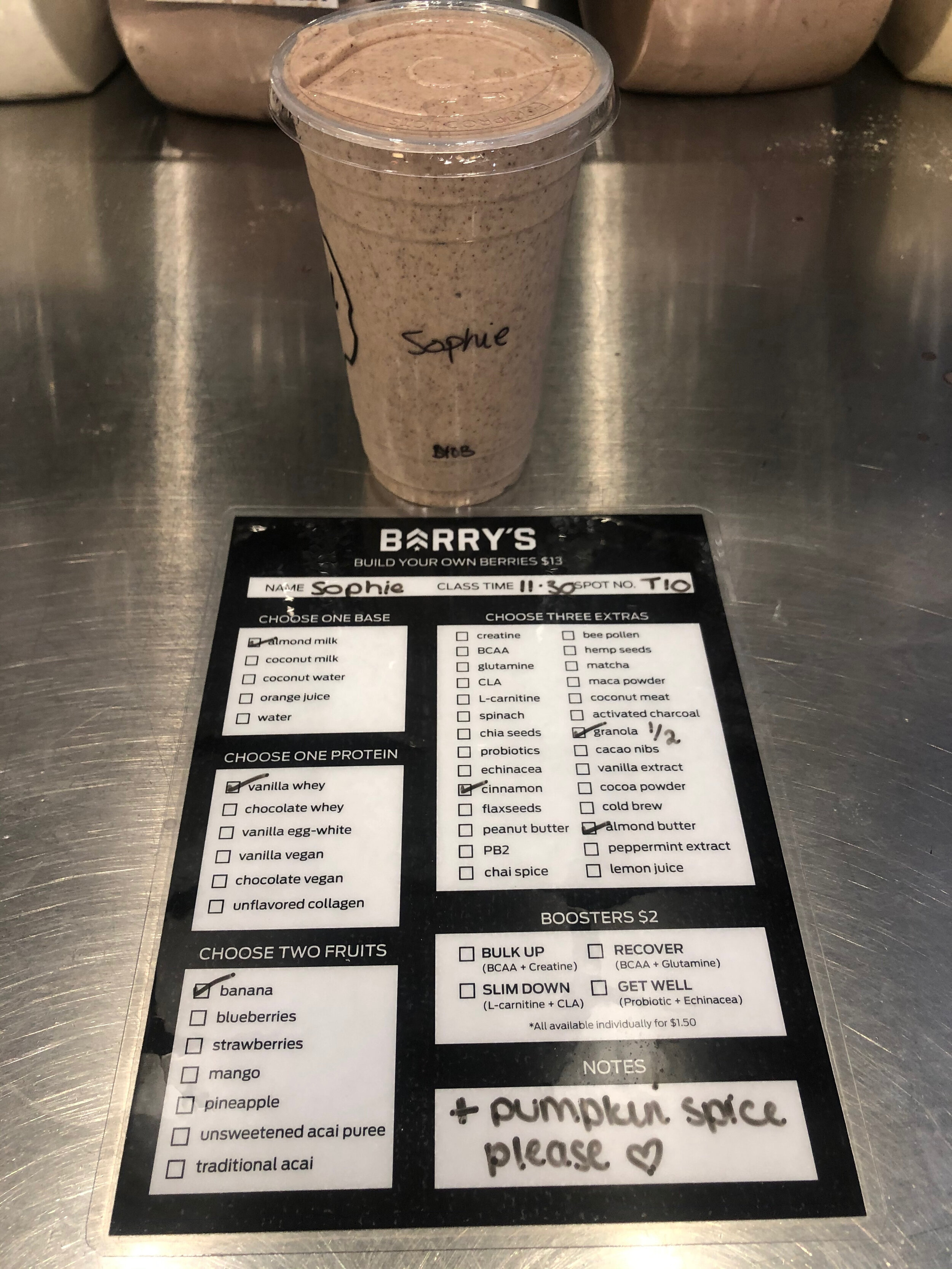
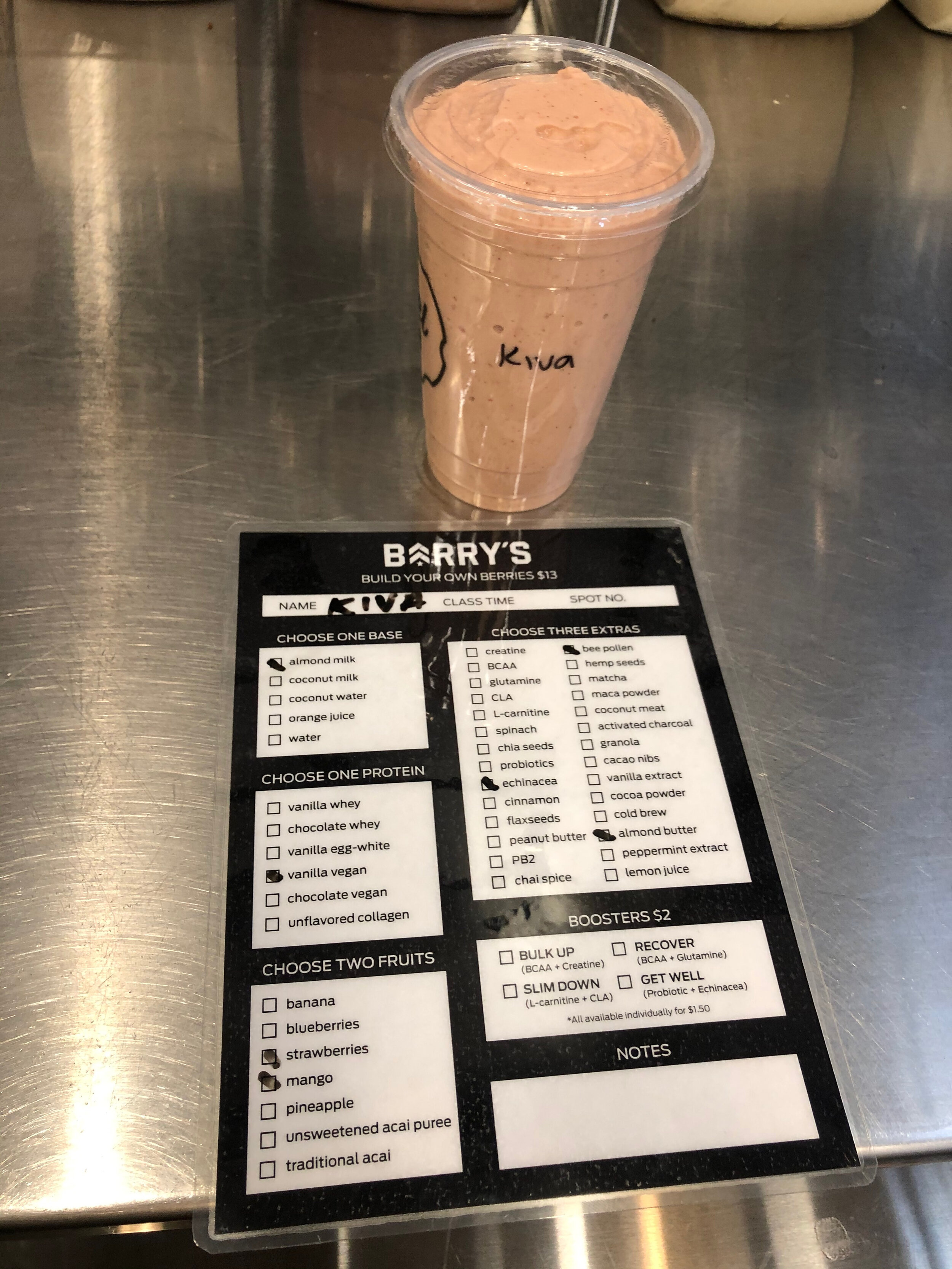
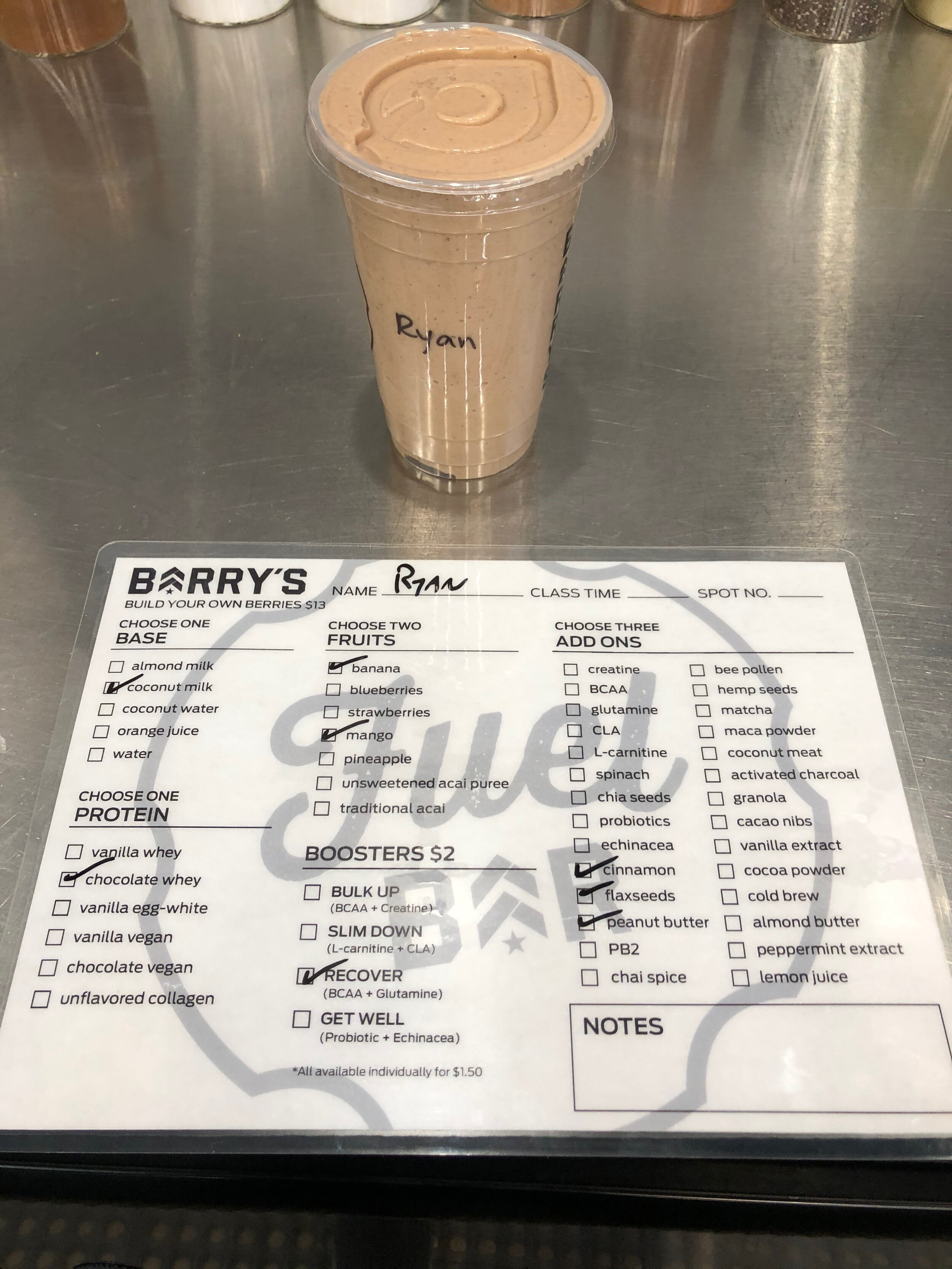
Build Your Own Shake
Clients now have the option to build their own shake by selecting from a few options before adding to their order. One of Barry’s core values is Honesty, I felt it would be good to add more information about the ingredients used in the products offered.
The user can click on the information button next to the ingredient list for latest health and allergy information.
Invision prototype: https://invis.io/WTVE61J7Y6X#/399109525_IMG_2895_1